 |
| Click on any of my ICA photos to enlarge them. |
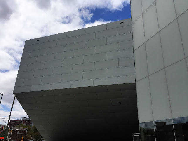
Since its 2014 ground-breaking, Virginia Commonwealth University's Institute for Contemporary Art, at the southwest corner of Belvidere and Broad Streets, has been a work-in-progress to be observed by one and all. The ICA will open to the public with an all-day party on Apr. 21, 2018.
The ICA's first show, “Declaration,” features work from 34 artists. It will be up through Sept. 9, 2018. In the coming months this varied exhibition will hardly be confused with traditional art shows we might have seen at the Virginia Museum of Fine Arts, such as those offering depictions of bowls of fruit or portraits of dandified monarchs.
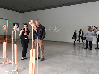
Yesterday I took an hour to walk through the airy new gallery space and glance at the art. What follows won't be a review of the art I saw. Nor will it be a criticism of the Fan District's striking new building. Still, I will take this opportunity to mention one particular notion that occurred to me while I was there.
Before I get to that point, I have to say the ICA is sitting on familiar turf. Having lived in the Fan District for most of my life it will be fascinating to watch the impact the ICA is bound to have on the old neighborhood. In the last 25 years, like it or not, with all of its new and refurbished buildings, especially on Broad St., VCU's architectural footprint on the heart of Virginia's capital city has become noteworthy.
However, this new building, designed by Steven Holl, promises to overshadow all of that. Like many Richmonders, when I saw the first artist's drawings of how the ICA would look, yes, I wondered about it. Why? Yet, since then I've deliberately tried not to form an opinion of its appearance.
Like, why rush to judgment? Instead, I decided to trust Joe Seipel and wait to see what I think when it's done. (Full disclosure: Joe is an old friend.) Reading and hearing lots of opinions concerning the ICA's somewhat eccentric look has only made me more determined to wait. So watching its progress, as I rode by on my bike, hasn't been a matter of trying to confirm a love or hate for how it has looked at various stages of its construction.
So now, having looked it over, inside and out – only briefly – I am happy to say I like the unusual-looking building and I love what I now envision it will do for VCU and my home town. What answers, call-and-response-wise, will it inspire?
Now I want to pass on something about the occasional angles and curves of the rooms inside the building that occurred to me, just yesterday, right before I left the ICA: The designer, Holl, has created a context for the displays that makes the art, itself, stand out more.
Dig it: our expectation, upon entering a conventional art gallery, has been that we will see everything framed by straight lines. Rectangles everywhere: the paintings in frames, objects in glass boxes, the galleries themselves with their vertical and horizontal lines. Right angles. The ceilings. The floors. The walls.
This isn't to say that all that has been wrong. But what Holl has done escapes some of those expectations. So, to me, the random curves and angles of the interior of the ICA, of the rooms large and small, make the pieces of art seem less confined, perhaps liberated. More eye-popping!
Thus, in a way I hadn't anticipated, this building's form is following function. While I won't suggest that Holl intended this factor from the get-go, or that he didn't, I do think it will gradually become more evident to other observers that it's true.
Bottom line: Go to the party on Saturday, 10 a.m. to 4 p.m., and see what you think.
-- 30 --


No comments:
Post a Comment